Product updates for July'22
There are 3 powerful new features we're delighted to share with you this month: “Conversions” section UI update, Reports enhancement and better stitching quality display.
Sophie RennEditorial Lead
|August 4, 2022|3 min read
New UI of “Conversions” section
The sections “Conversions” and “ML Models” have now been merged into one single section, called “Conversions”, on SegmentStream’s platform. Conversions and ML Models are now displayed with hierarchies: Target – ML Model – Modelled Conversion. The flow of creation of entities is simplified — users can create a child entity right from the parent (e.g., a Modelled Conversion from the ML Model view). The main two differences are explained below:
-
Previously users had to create a simple conversion in the Conversions section, go to the ML Models section to create a model and then return to Conversions to create Modelled Conversions.The new design allows users to create conversions, ML Models, and exports from a single flow — consecutively adding new entities from one place.

-
Previously users had to open an entity view to observe statistics such as the number of conversions, daily charts, and ML Model metrics. Now all the vital statistics and settings are displayed right on the Conversions home screen.

Reports: row comparison in the chart
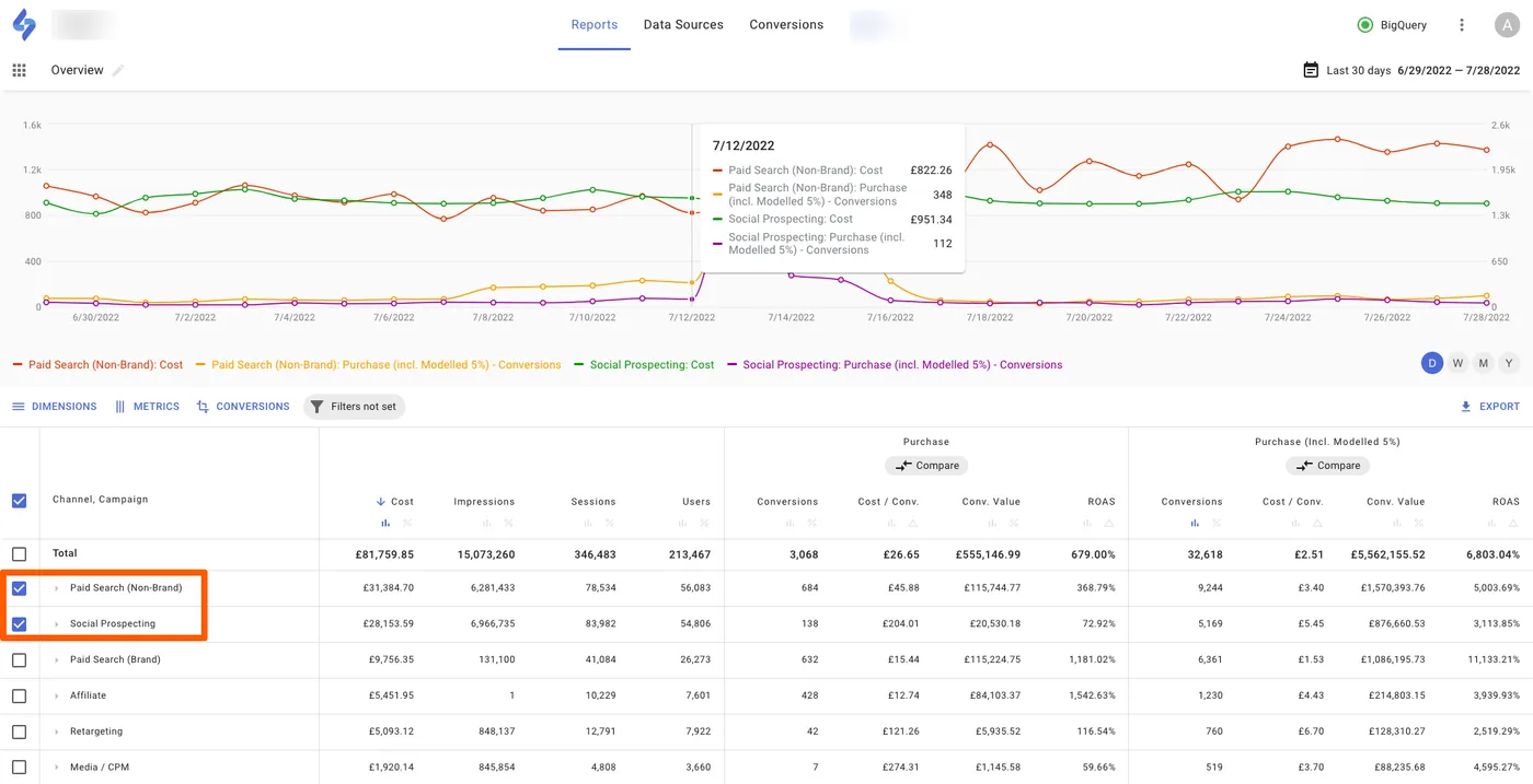
Users can now compare time series of two or more rows in the chart for each metric that is selected in the table. This feature is available for the first level of the dimension hierarchy. For example, users can compare the time series of two campaigns that participate in an A/B test in one place.
Previously only Total values were displayed in the chart and there was no easy way to compare the time series of several channels, ad platforms or campaigns. To compare, users had to open a number of tabs with Reports and compare time series on different scales.
How to enable the feature
-
Navigate to a Report
-
Choose rows with checkboxes to compare in the chart
-
Hover over the chart to observe the data in the tooltip
-
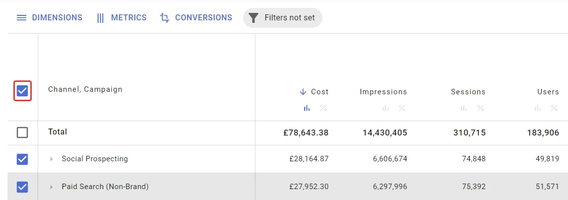
If needed, reset the selection by clicking the checkbox at the top
Display true stitching quality
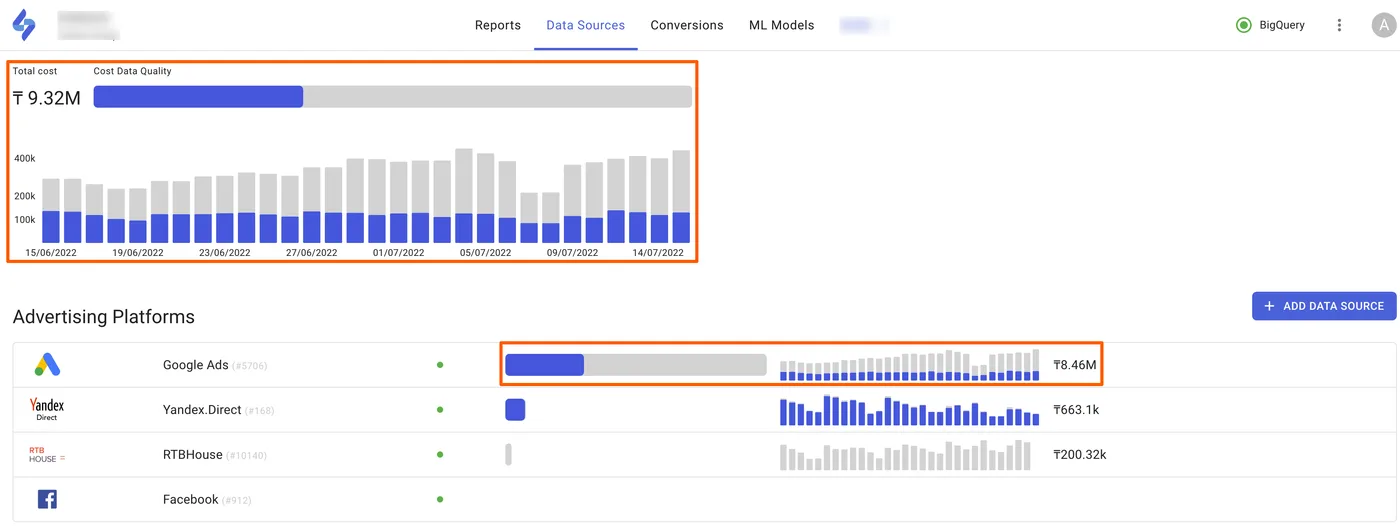
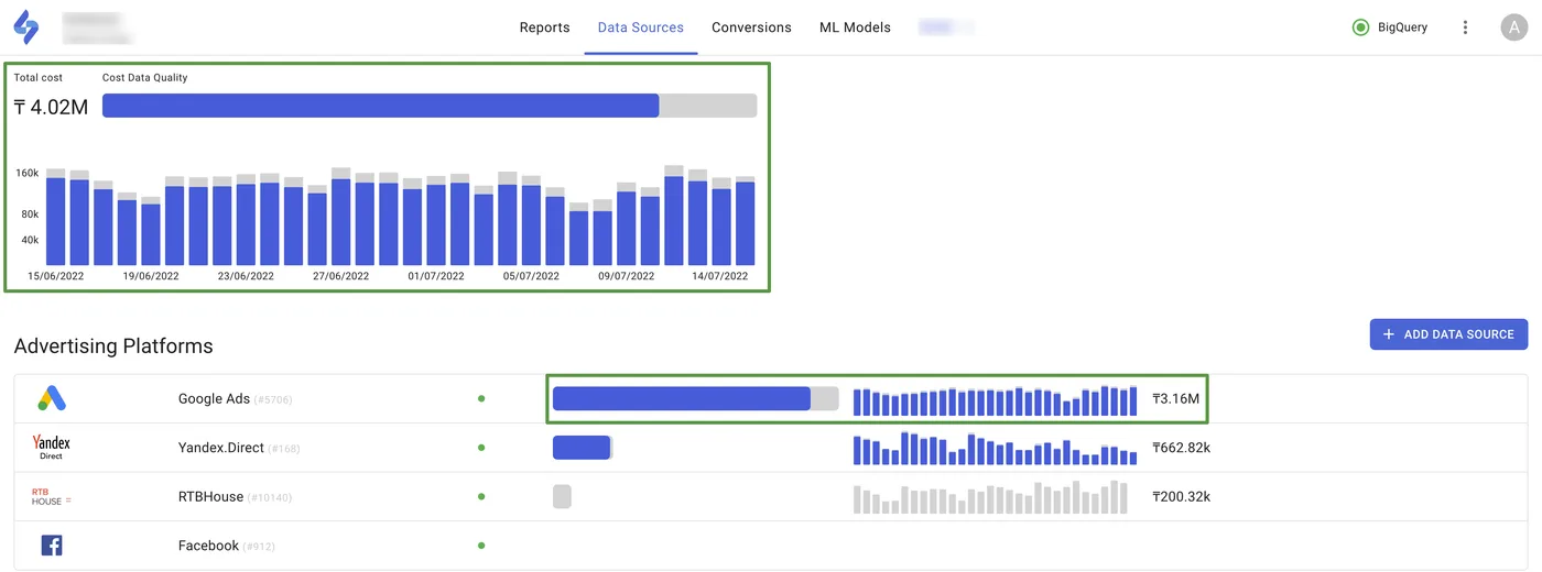
Users can see true stitching quality for projects where there is ad spend that cannot be stitched with sessions (ads leading traffic to Facebook posts, App Store etc.).
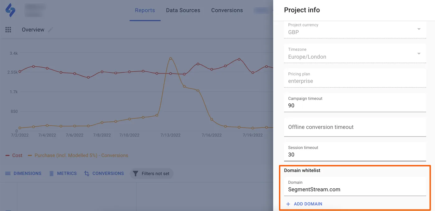
When setting up a project, the user can now configure the domains that will be tracked by their behavioural data source in the domain whitelist setting. As a result, only ads that are leading to domains matching the whitelist will be used in the stitching quality calculation formula.
Before:
After:
How to enable the feature
- Navigate to Project info
- In the Domain whitelist setting, enter the list of the domains used by your project
- Click Save
- Now your cost data quality graph will calculate stitching and display costs only for the ad spend that leads to the specified domain list
